Formatting is one of the most misunderstood parts of resume writing in the age of applicant tracking systems. Many job seekers assume that formatting is mostly visual, something designed to make a resume look polished or attractive for recruiters. In reality, formatting affects much more than appearance. It determines how clearly your information is interpreted by software, how easily recruiters scan your experience, and whether important details remain intact when your resume enters an employer’s hiring system.
A resume can contain strong experience, relevant achievements, and well-chosen keywords, yet still underperform if the formatting creates friction. That friction often appears before a human recruiter even reviews the document. Applicant tracking systems attempt to read, classify, and organize the contents of uploaded resumes. If the formatting is inconsistent, overly complex, or built around decorative elements rather than clear structure, important information may be misplaced, misread, or simply harder to surface later in search results.
Before changing layout decisions, it helps to understand what employers actually mean when they ask for an ATS-compatible resume and how those systems process content.
This does not mean resumes should look plain or stripped of professionalism. It means formatting should serve communication first. The strongest ATS-friendly resumes are usually those that balance readability, consistency, and structural simplicity while still presenting the candidate professionally.
This guide explains which formatting choices help applicant tracking systems process resumes correctly, which common design habits create unnecessary risk, and how to build a resume that works well for both software and human reviewers.
Why Resume Formatting Matters More Than Many Candidates Realize
When employers receive applications through digital hiring systems, resumes are rarely reviewed exactly as uploaded in the first step. The document is usually parsed, converted into structured text, and broken into fields such as contact information, work history, education, certifications, and skills.
The system does not interpret layout like a human does. A recruiter can instantly understand visual hierarchy, spacing, and emphasis. A parsing engine often cannot. It depends on predictable signals. It expects recognizable headings, logical content flow, and clearly separated sections.
If the formatting introduces ambiguity, the system may assign content incorrectly. Dates can separate from job titles. Skills may merge into summary paragraphs. Contact information can disappear into headers. Entire sections may lose meaning if they rely on tables, sidebars, or graphic elements.
This is why formatting is not simply aesthetic. It directly influences whether your experience is understood accurately inside the hiring workflow.
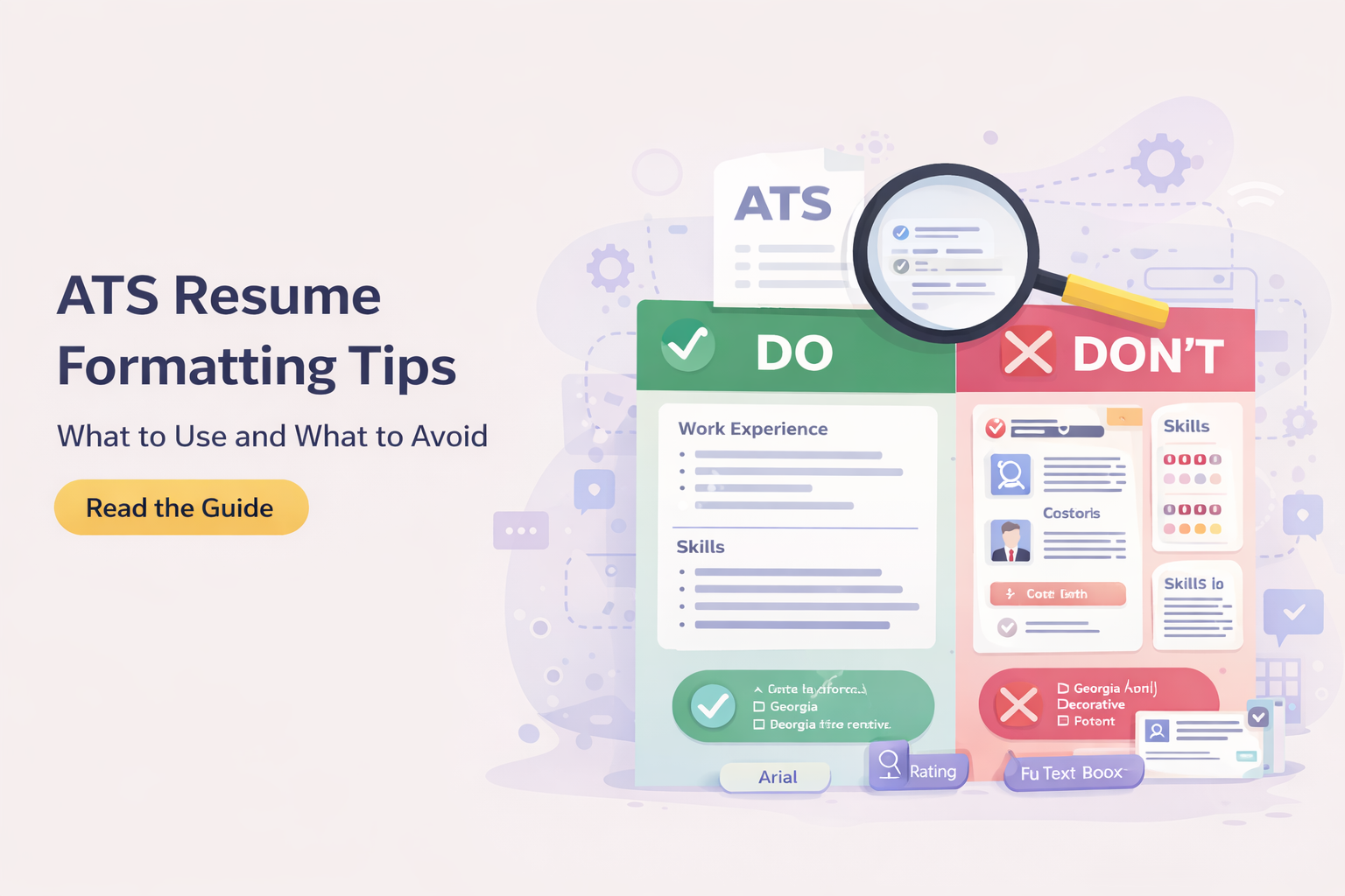
The Safest Resume Layout for ATS Compatibility
The most reliable layout remains a single-column structure.
A single-column resume creates a straightforward reading order from top to bottom. It allows both applicant tracking systems and recruiters to follow the same information sequence without interpretation problems.
Two-column resumes often look modern, but they introduce risk. In many designs, one column contains contact details, skills, certifications, or summary information while the other holds work history. Some ATS systems read left to right across the page rather than understanding parallel columns. This can scramble content, mixing unrelated sections together.
That does not mean every two-column resume fails, but the margin for error is much smaller. Single-column layouts remain the most dependable option across systems.
The strongest ATS resumes usually place contact details first, followed by summary, work experience, education, and skills in a clean vertical sequence.
Best Fonts for ATS-Friendly Resumes
Fonts should be chosen for readability rather than style experimentation.
Applicant tracking systems generally process standard fonts more reliably because they render predictably across systems and document formats. Fonts such as Arial, Calibri, Helvetica, Georgia, Cambria, and Verdana remain among the safest options.
This does not mean every non-standard font will fail, but decorative fonts, narrow fonts, and unusual typefaces can create readability issues when documents are converted or parsed.
Font size also matters. Main text usually performs best between 10 and 12 points. Section headings should remain visually distinct but not oversized. Consistency is more important than dramatic contrast.
A resume should feel calm and easy to scan. If typography draws too much attention to itself, readability usually suffers.
Section Headings ATS Systems Recognize Best
Applicant tracking systems rely heavily on recognizable section labels.
Creative headings often look appealing but can reduce parsing clarity. For example, replacing “Work Experience” with “Career Journey” may sound elegant to a human but can weaken machine interpretation because many systems are trained to recognize standard language.
The safest headings include:
- Professional Summary
- Work Experience
- Education
- Skills
- Certifications
- Projects
- Languages
These labels create immediate clarity. They also help recruiters scan faster because they align with expectations.
A resume does not become stronger by inventing section titles. In most cases, clarity outperforms originality here.
Why Tables and Text Boxes Often Create Problems
Many visually polished resume templates use tables, text boxes, or segmented content blocks to control layout. While these elements can look clean inside editing software, they often introduce parsing risk when uploaded into ATS platforms.
Text boxes may separate from the main reading order. Tables can cause the system to read across cells incorrectly. Dates may align visually in the template but become disconnected once parsed.
The danger is not always obvious because the file still looks correct when opened normally. The issue appears only when the ATS attempts to extract text.
For that reason, important content should remain in the main document flow whenever possible. If a design element is used, it should never hold critical information that must be interpreted correctly.
Should You Use Bullet Points in an ATS Resume
Bullet points are helpful when used properly.
Recruiters scan quickly, and bullet points help separate achievements into readable units. ATS systems also handle bullet lists well when they remain simple and consistent.
The safest bullet symbols are standard circles or dashes generated by normal text editors. Decorative icons or unusual bullet graphics can create inconsistencies during parsing.
Each bullet should ideally focus on one measurable responsibility, contribution, or result. Dense blocks of text reduce readability and make accomplishments harder to distinguish.
A strong resume often uses concise bullet points under each role, written in a way that balances clarity and evidence.
Headers and Footers: A Common Hidden Risk
Many candidates place contact details inside document headers because it creates visual neatness. Unfortunately, some applicant tracking systems ignore header and footer content or parse it inconsistently.
This means phone numbers, email addresses, LinkedIn links, or even names can become harder to capture.
The safest approach is to place contact information directly in the main body at the top of the resume.
A simple contact line usually works best:
- Name
- Phone number
- Professional email
- LinkedIn profile
- Location
This ensures that critical details remain visible both to systems and recruiters.
Icons and Graphics: Why Less Usually Works Better
Modern templates often add icons next to phone numbers, email addresses, skills, or section titles. While these elements may improve appearance slightly, they add little practical value and sometimes interfere with parsing.
Applicant tracking systems do not need icons to understand meaning. In some cases, icons can introduce character recognition problems or disrupt line structure.
The same applies to charts, rating bars, progress meters, and skill graphics. A visual bar showing software proficiency may look attractive but communicates poorly in ATS environments because software cannot reliably interpret graphic meaning.
Text remains stronger than decoration when information must survive system processing.
File Margins, Spacing, and Visual Balance
Good formatting is also about breathing room.
Resumes that are too dense create visual fatigue for recruiters. Resumes with excessive spacing waste valuable space and weaken content density.
Margins around 0.5 to 1 inch usually work well. Line spacing should remain consistent across sections. Section breaks should be visually clear but not exaggerated.
Spacing helps define hierarchy. It tells the reader where one section ends and another begins without needing heavy graphic separators.
A resume that feels visually calm often communicates professionalism before any sentence is read.
The Best File Format for Formatting Stability
Formatting behaves differently depending on export format.
DOCX files often preserve editable text structure well and are widely accepted by applicant tracking systems. PDFs preserve visual layout more consistently but can create issues if generated poorly or if text becomes embedded as image layers.
A strong rule is to test both versions.
Open the file on multiple devices. Copy the text into a plain text editor. If the reading order remains clear, the structure is likely stable.
If the employer specifies a file type, always follow that instruction. Compatibility matters more than personal preference.
Formatting Mistakes That Often Hurt ATS Performance
Some formatting issues repeatedly appear in resumes that underperform.
Multiple columns containing important content remain one of the biggest problems. Excessive visual design often follows closely behind. Overuse of bold text, inconsistent date placement, mixed bullet styles, and irregular heading patterns all reduce clarity.
Another frequent issue is over-compression. Candidates try to fit too much information into one page by shrinking text, tightening margins aggressively, or reducing spacing until readability suffers.
A strong resume does not need to feel crowded. Prioritization usually improves performance more than compression.
Formatting alone is not enough if the document lacks relevant terminology, which is why strong ATS resumes also depend on using keywords naturally without damaging readability.
How Formatting Affects Human Recruiters Too
Even when ATS parsing succeeds, recruiters still judge readability immediately.
A recruiter often spends only a short amount of time deciding whether to continue reading. Strong formatting supports that decision by making information easy to locate.
Job titles should stand out clearly. Dates should be easy to identify. Company names should remain visible. Achievements should not disappear into heavy paragraphs.
Formatting creates speed of understanding. That speed often determines whether deeper reading happens.
The Right Balance Between Simplicity and Professionalism
Some candidates overcorrect when learning about ATS compatibility and make resumes look too plain. Simplicity does not require losing professionalism.
A well-formatted ATS resume still benefits from subtle hierarchy, clean typography, strong spacing, and thoughtful alignment.
The goal is not minimalism for its own sake. The goal is reducing friction while preserving confidence and clarity.
When formatting supports reading rather than decoration, both systems and recruiters benefit.
Final Thoughts
ATS-friendly formatting is not about removing personality from a resume. It is about making sure your experience survives every stage of modern hiring systems without distortion.
The strongest resumes use predictable structure, readable typography, standard section headings, and clean spacing. They avoid unnecessary visual complexity while still looking professional and intentional.
Formatting rarely gets credit when a resume works well, but it often explains why equally strong candidates receive different outcomes.
A resume should not force software or recruiters to work harder than necessary. Good formatting removes that burden and lets your actual experience carry the weight.
Frequently Asked Questions
What resume layout is safest for ATS?
A single-column layout remains the safest because it preserves clear reading order.
Are two-column resumes bad for ATS?
Not always, but they introduce more parsing risk.
Which fonts work best for ATS resumes?
Arial, Calibri, Helvetica, Georgia, Cambria, and Verdana are reliable choices.
Can I use icons in my resume?
Icons are best avoided because they add no parsing value and may create recognition issues.
Should contact details be in the header?
No. Contact information should stay in the main body of the document.
Are bullet points ATS-friendly?
Yes, when simple and consistent.
Is PDF safe for ATS?
A properly generated text-based PDF usually works, but DOCX often remains the safest default.